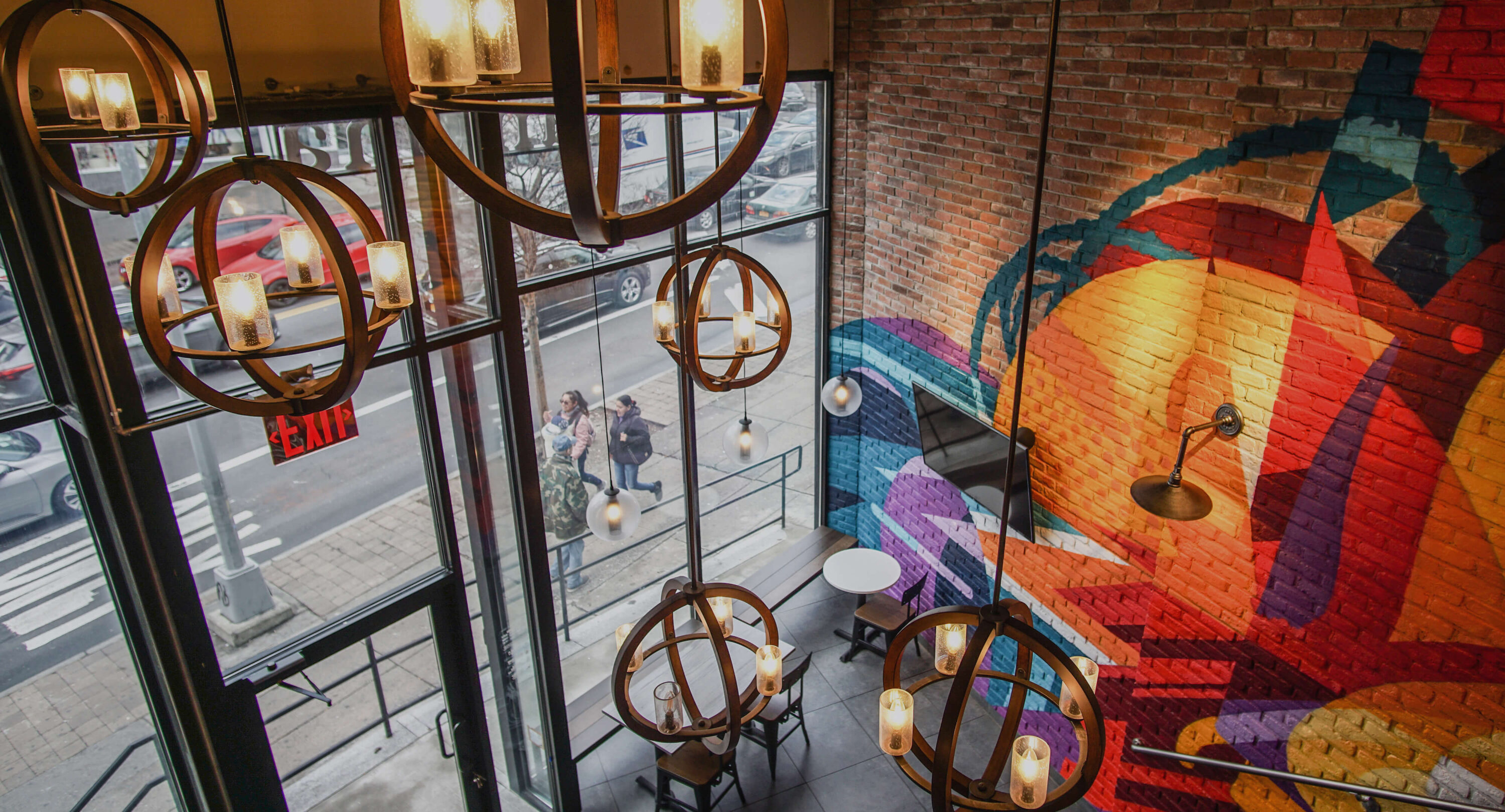
Crafting unforgettable spaces for big names
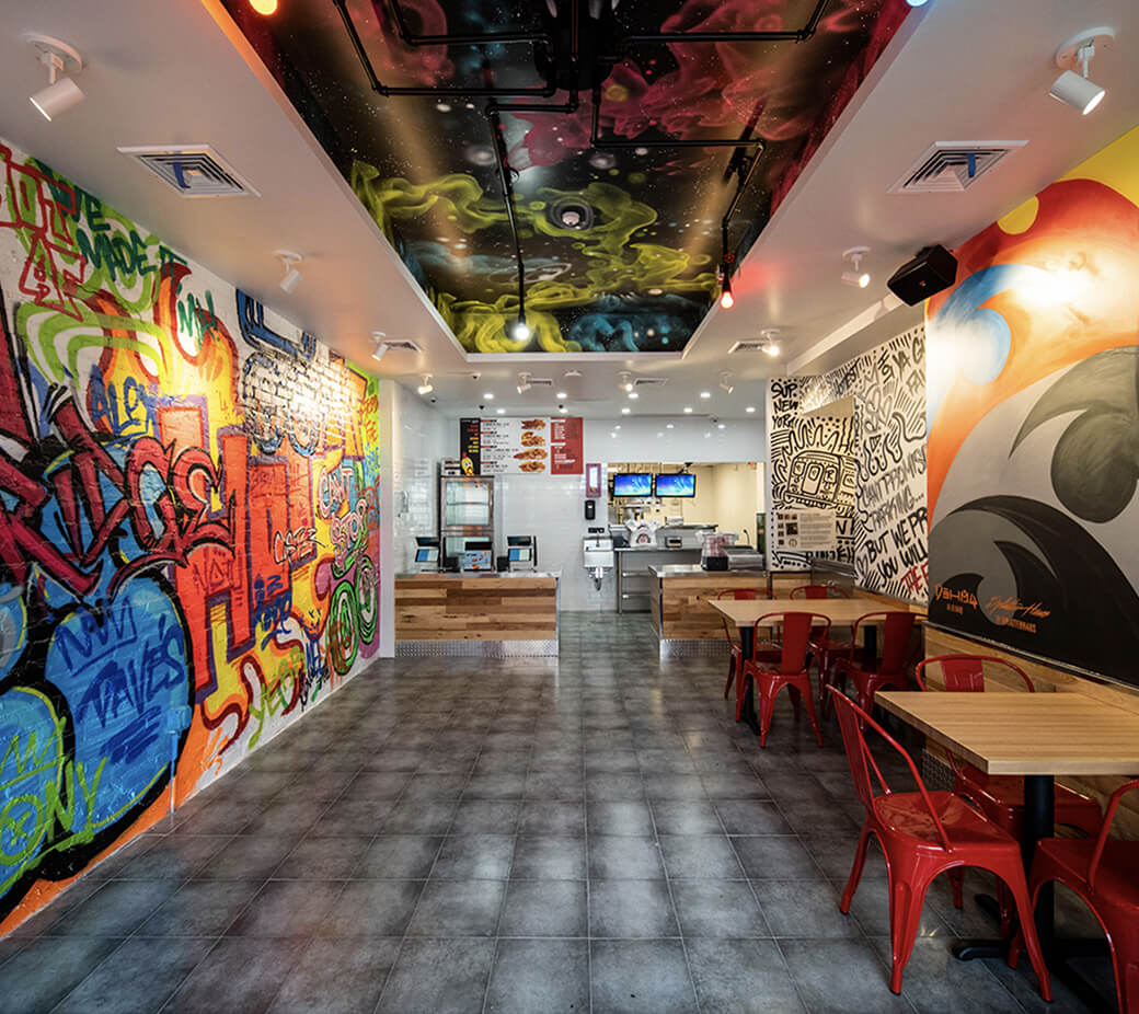
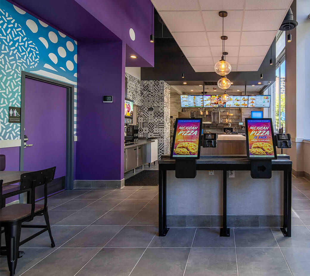
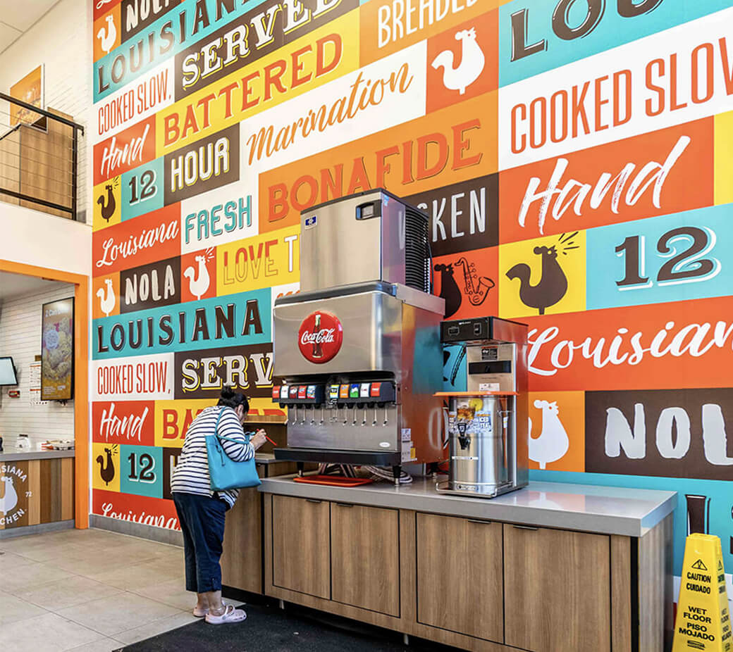
Zelta has designed and built some pretty impressive spaces for brands you might be familiar with—do Taco Bell, Popeyes, and Dunkin’ ring a bell? When they came to us looking for a new responsive website, we knew we had to create something that showcased their innovative design approach and seriously impressive portfolio.
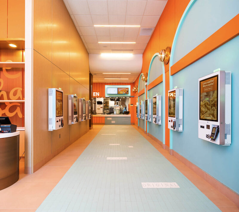
A full service multidisciplinary architecture firm that packs a punch
From your first glimpse at their website, you know Zelta knows what they're doing. We didn’t want to waste any time getting to their amazing projects, which is why we made sure to highlight some of their favorite portfolio pieces right on the homepage.

Letting our
creative flag fly
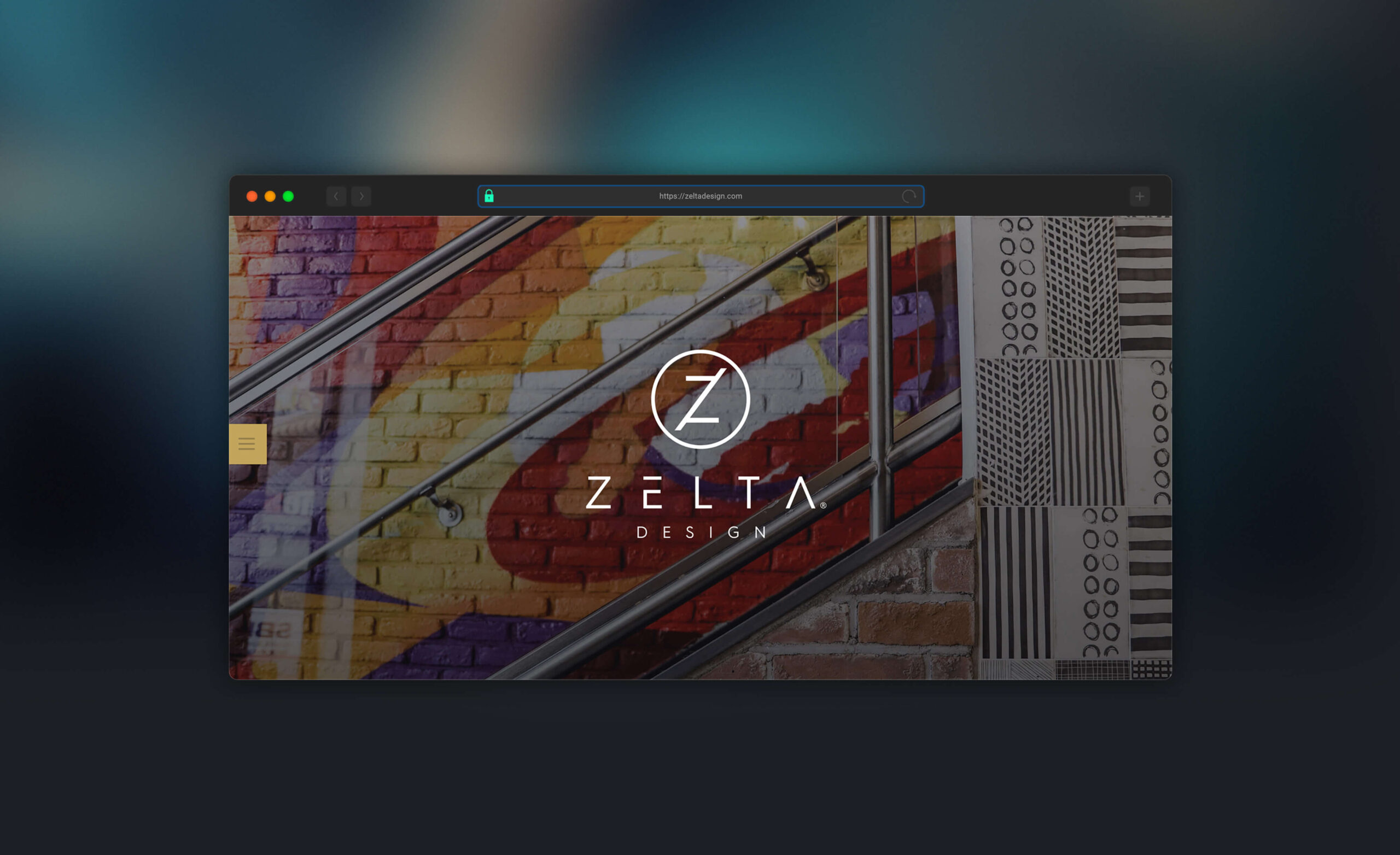
Since Zelta’s projects tend to feature vibrant colors and bold patterns, we wanted to utilize a clean, minimalist site design to allow their portfolio to really take center stage.
To add some interest and excitement to the user experience, we incorporated subtle parallax scrolling effects and fading transitions throughout the website. We love getting to play with movement on a site. It takes a strong design and gives it a whole new life. And in this case, it’s the perfect compliment to Zelta’s stunning showcase.

Showcasing the best in commercial & residential architecture
A great website has to do more than just look good (though we like to think we hit that mark pretty well)— it should provide the user with an optimal viewing experience, easy navigation, and fast load times. All of our websites are designed to be responsive with a mobile-first approach, and Zelta is no different.
